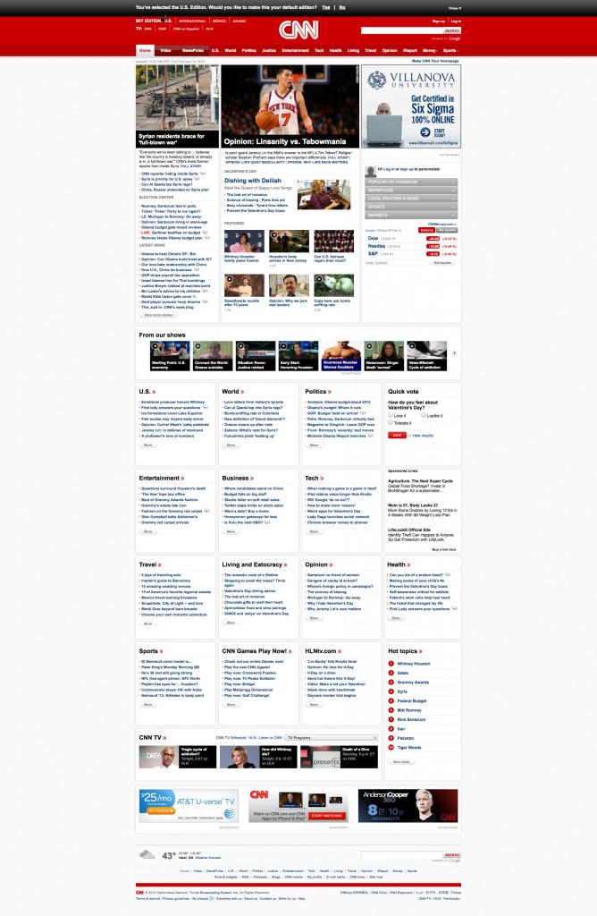
What are the components that make a fantastic website design? Is it positioning of items? Is it the color palette? Is it negative space? It certainly is a combination of all these factors and many more. In this edition, we will be doing a 3 minute critique of CNN.com.
General Assessment
The CNN website is great. It has a lot of information and therefore the biggest challenge for the designers is the presentation of that information without extending the homepage indefinitely. The color palette is relevant and pleasant, not distracting. Certainly using a non-traditional grid with gutters smaller than the traditional 20pixels, which helps to maximize the available horizontal space. Three main columns separate content to designate hierarchy effectively. It is well organized and believe me, organization of this kind of website is probably the biggest challenge that a designer could have.
Header Bar
I really like the fact that the logo is used in the center as opposed to the traditional left side. This makes it look more authoritative. Search bar to the right powered by Google (no surprises here). Then we are presented with the navigation bar. This website’s homepage is ultimately a navigation bar on itself. However the designer uses the navigation bar to maintain consistency across the site. One big problem in the main navigation bar is that the Home link is located at the very first position. You may think that this is not a big deal, however with a site this big, I would think that they are interested in people spending as much time as possible in deeper sections of the site. The more involved they get with particular sections the better. In the English language we read from left to right and from top to bottom. Making it more likely that CNN users will start reading the navigation bar and therefore return to the homepage with more frequency than if it was at the end of the navigation bar. Another inconsistency that can be found is the use of bullets at the end of the two last sections: Money and Sports. The bullet usually represents that you can hover and access a dropdown menu. However in this case this doesn’t happen. In other words, there is no real point in having those bullets other than perhaps giving it a bit more of attention. I recommend changing the navigation bar items that need prominence to the left in the hierarchy and remove the bullets.
Finally in terms of color, I personally like the red hue and shades that are being used.Specially because it is not overpowering. The use of color red is very difficult because of its intensity. In this case, since it is limited to the top header then it doesn’t feel overpowering.
Content
I think that the content is beautifully presented. Almost everything is click enabled and you are capable of going directly to the section that you are interested in.
Sub Headings
I don’t like the top margin that is being used in the subheadings. I feel like the subheading belongs to the previous news item instead. I know that the designer is already using all caps, different color and font-type. However I still would love to see some top padding or margin larger than the one found below the subheading.
Below the Fold
Below the fold you transition to four columns instead of three. Well defined sections that each have a fantastic and clear heading. Even with the enormous amount of information there is plenty of white space used in this section which makes it easy to read. Sponsored links are somewhat different in terms of styles and therefore at least let you decide if you want to click on them.
Nothing is Poping and moving
I really like the fact that at least in my visit to it, nothing was popping up uninvited. Nothing was moving either, in fact flash wasn’t even present. Not that I don’t like Flash, I do, however in some things I think that static content is better. I don’t like moving objects screaming for my attention, specially if it is coming from advertising. So in this case they have done a great job limiting all that animation in the homepage.
CNN.com has done an excellent job administrating their flow of content. I think that we have a lot to learn from them.
Until next time,
Alex


