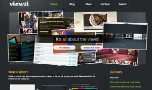
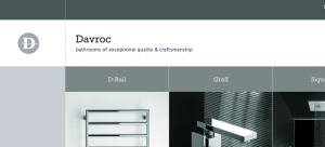
These days I have seen lots of people writing about tips on how-tos. Now there are great tutorials out there for web designers trying to improve their design techniques. Unfortunately what I have found is that most of them start from scratch and explain the techniques from a building perspective. Not that there is anything wrong with that approach. Simply put, I am writing this post but instead of building the techniques I will be analyzing three excellent examples.
TIP 1. Use Color, Position, Distance and Alignment to portrait importance. In figure number one, you can see how the designer decided to use 3 different colors in one paragraph of text! The white color automatically gets less importance, the yellow text gets a nice accent and then finally the call to action is found in red (which is an excellent color for action).
TIP 2. Mantain your number of hues to a minimum. The more color that you use the more time a common user would take to decipher what is important. In order to improve usability you want to color code your actions in a way that becomes automatically intuitive to do something. For the most I would say use 3 hues, then you can add another 3 shades or 3 lights to those shades. My favorite is to keep websites to almost a monochromatic scheme and then create accents with a split complementary or even a complementary hue. Unfortunately as I progress towards finishing the design, I end up adding other hues; I have to force myself to change extra hues for shades of the same hue.
TIP 3. If you decide to go with sharp angles then go with sharp angles. If you go with rounded corners then be consistent as well. As part of the WEB 2.0 trends we have seen lots and lots of design that use rounded corners. If used properly, rounded corners look really good and make design look softer and more inviting. Unfortunately the entire experience can be thrown to the trash can with just one thing: inconsistency. The secret really is not so much having rounded corners, the secret is to maintain those treatments across the different sections of the design. As a counter-example check out image number 3. This designer decided to only use sharp angles (including the pictures). That makes the design so powerful that it immediately makes a positive impression.
That is it! I hope you guys enjoy this tutorial and really hope that it helps improve your design and gives you at least another point of view.
Until next time,
Alex A. Centeno MBA.
Digital Media Director
Merkados™


