You might be wondering what is the purpose of this post. And let me explain where I am coming from before I start. Lately I have seen that a lot of design tutorials focus on teaching technique, not decision of technique. In other words, they teach you how to do something, but they don’t teach you why they decided to use that technique in the first place.That’s what this post is for.
Obviously, the reasoning behind design is a very large topic and can’t be covered completely here. But this should be taken as an introduction to meaningful design.
White Space
Design usually is associated with several elements like shape/type, size, placement, etc. One of the most important decisions for a designer is white space. Many designers have a lot of trouble not filling up the canvas. Why? Well, I guess some feel that if the canvas is not full that the client is going to think that they are lazy. And this is true sometimes. However, is harder for a designer to abstain from adding more and more.
The main question that I try to answer in regards to white space is: Is this the most minimal way of powerfully presenting the idea?
Lets take a look at an example:
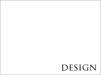
I am trying to illustrate the word Design in a white square.
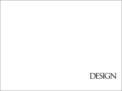
So far so good. It looks good and it seems like indeed is minimal enough however I feel like the white space itself is not adding to the design. So lets go ahead and iterate in order to modify the white-space:
Can you tell what changed from example 1? First, the right margin length is equal to the height of the font. That gives the sense of order and purpose for that margin. Second, the bottom margin is equal to double the distance of the right margin. This creates a point of interest while keeping it organized. Finally, the spacing between characters of the word Design (the kerning) has been adjusted to make the word appear more as a cluster – an object. Now, we have a background and a subject that are clearly defined and separated and they have a relationship.
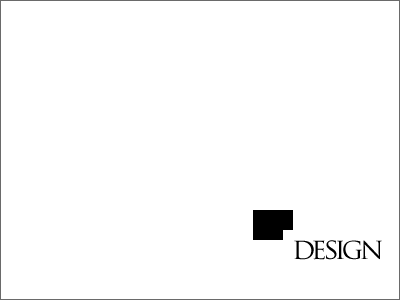
To finalize this example I decided to replicate the overall white-space shape, invert it and add it to the corner of the word Design to add balance to the message.
Now, in this example we have very little background to make design decisions. But in real life examples, as a graphic designer, you would have a client that has a market to satisfy and a product to sale. That should strongly drive your design decisions.
Final thoughts: How can this translate into an active recommendation that makes your design better? Ok, next time that you sit down to layout ask the final question about your white space and how it is adding to your design and if it could do a better job.
I hope this helps and thanks for reading.
Alex Centeno +


