Most of the time we give examples of bad design. So today I decided to give our readers a break and show some great design and hopefully explain some of the reasons why we think these designs are better than average in terms of design. So for today we have four designs in total. So we are going to start with the most simple and then finish with the best.
Number 4.
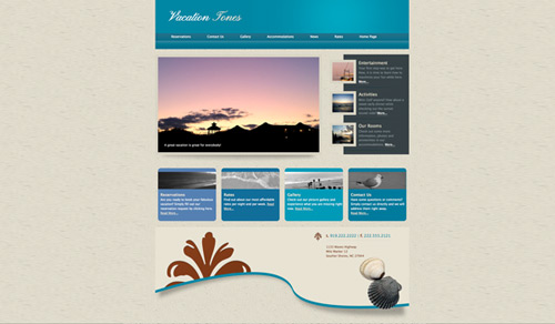
http://www.SimpleHotelSites.com
SimpleHotelSites is not per-se a hotel site, it is more a template for hotel sites. However it is in our list, first because we were involved in the design, but also because we love the simplicity of its footer. These days most designers invest the majority of their times designing interaction, and the main section of the content. However, very seldom we see somebody investing time in finishing strong – the footer. So here it is to SimpleHotelSites.com
Number 3.
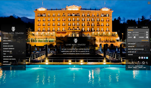
http://www.grandhoteltremezzo.com/
The idea behind this design is very bold. They are using a complete 100% background that stretches depending on the screen size of the user. Very cool that you can toggle in and out the important navigation and the reservation request bar. Great execution. Of course, the problem becomes evident if the user has a large screen and therefore some pixelation occurs. But overall it is a beautiful design.
Number 2.
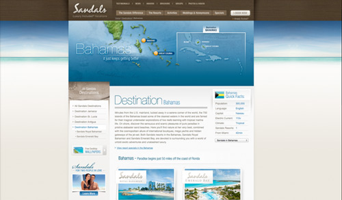
http://www.sandals.com
This hotel site is extremely clean and well designed. Even when you take a look at the enormous amount of information that they are trying to present in the homepage. This amount of information automatically makes any site very difficult to read, however they have managed to organize it beautifully without looking crowded. Also, the temptation would be to increase line-height (leading) in the main text to make it appear more roomy, however they cleverly reduced the value of the text in paragraphs and maintained a nice cadence while reducing the overall size of the scrolling bar. Organization is key. I love how they finish with a bold telephone number that makes it clear that they are in business. Minor mistakes made me place it before the winner.
Number 1.
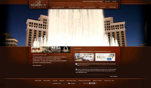
http://www.bellagio.com/
It is obvious to me that a hotel like Bellagio would have a fantastic website. However, it seemed obvious that other hotels in Vegas would also have them, wrong. They don’t. So that is why I am giving this one the edge. I like the extra attention that they gave to online marketing details like the organization of the main navigation items. From most important to least important (left to right). They placed the Make a Reservation Item FIRST, and not last. Very important distinction. This shows care and attention to detail.
Not to even mention the fact that the video execution is marvelous. It re sizes correctly without creating horizontal scroll bars in smaller screens. This is absolutely one of my favorite features. Of course I had to study the css myself because of the great execution.
In terms of usability I feel like there was a bit more that could’ve been done. Specially in the critical item of requesting a reservation. This should be a process that is easy and fast.
So there you have them folks. Please don’t hesitate to comment below or if you happen to have an example of a great website or a bad design simply send it our way as well.
Hasta la vista.


